This term, our students have been combining their knowledge from science and maths to explore one of the most important issues facing our planet: climate change. As part of a cross-curricular project, pupils worked in groups to investigate different climate-related topics, using the statistical skills they developed in maths to interpret and present real-world scientific data.
Here’s a snapshot of the fantastic work they produced:
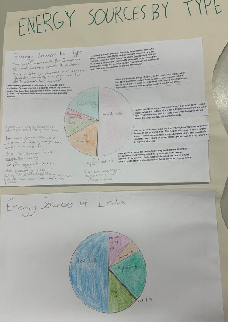
Group 1: Comparing Energy Sources – UK vs India
Group 1 investigated how different countries generate their energy. They discovered that in the UK, wind energy is now the leading source, while in India, coal remains the primary energy provider.
They discussed why this difference exists. The UK has invested heavily in renewable energy infrastructure and benefits from strong and consistent winds, especially offshore. In contrast, India relies more on coal due to its large domestic coal reserves and growing demand for affordable energy in a developing economy.
The group clearly presented their findings using pie charts, making the differences in energy sources easy to understand.
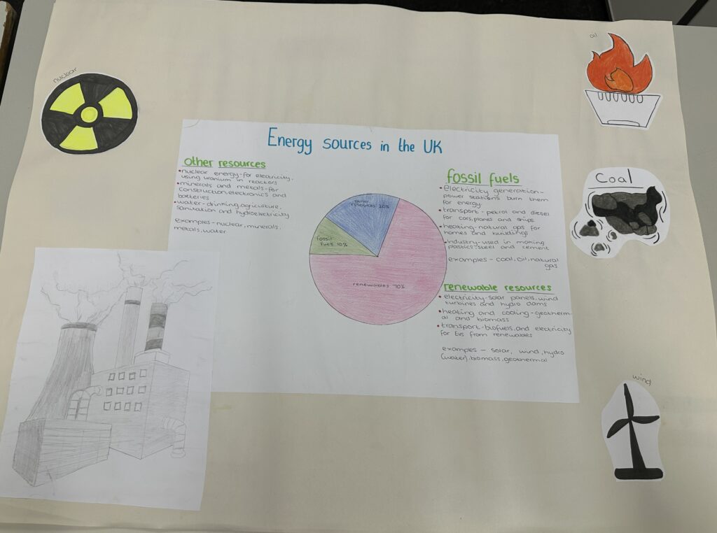
Group 2: The UK’s Renewable Energy Success
Group 2 focused more closely on energy use within the UK. They were pleased to find that renewable energy now makes up the majority of the UK’s energy supply—a sign of the country’s ongoing commitment to reducing its carbon footprint.
Using another well-designed pie chart, they showed how wind, solar, and other renewable sources now outpace fossil fuels in the UK’s energy mix.
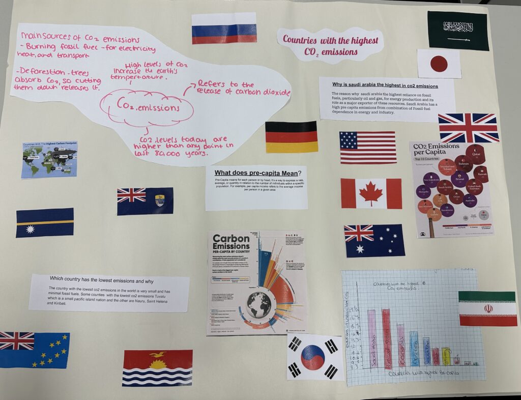
Group 3: CO₂ Emissions by Country
Group 3 examined global carbon dioxide emissions, identifying which countries produce the most and what that means on a per capita basis. They explained that “per capita” means emissions divided by the number of people—so it shows how much CO₂ each person is responsible for on average. Their research revealed that Saudi Arabia has the highest CO₂ emissions per capita, largely due to its oil industry and high energy use per person. They used a bar chart to compare emissions between countries and make the data accessible
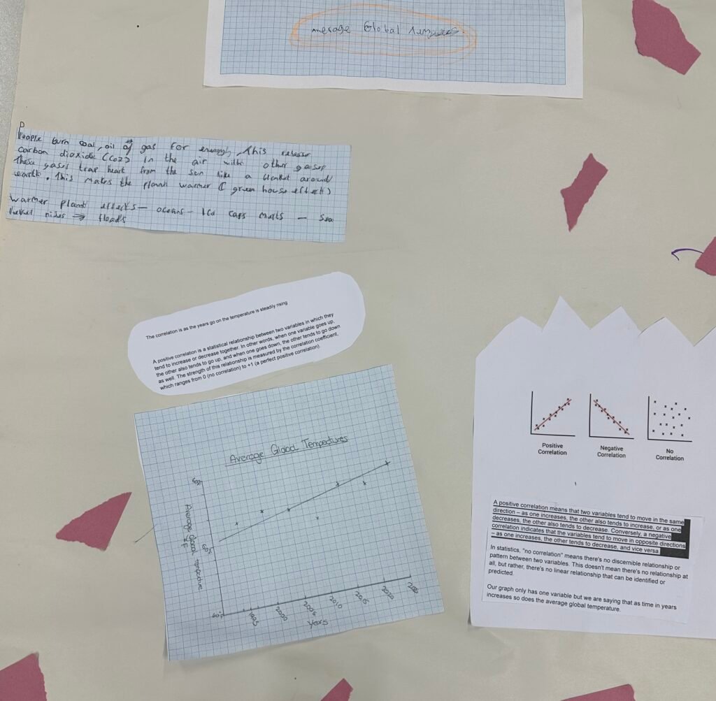
Group 4: Global Temperatures on the Rise
This group explored how global temperatures have changed over time. Using a scatter graph, they plotted temperature data from past decades and found a clear upward trend—evidence of global warming in action.
This group made great use of their maths skills to interpret the pattern in the data and connect it to what they had learned in science about greenhouse gases and climate change.
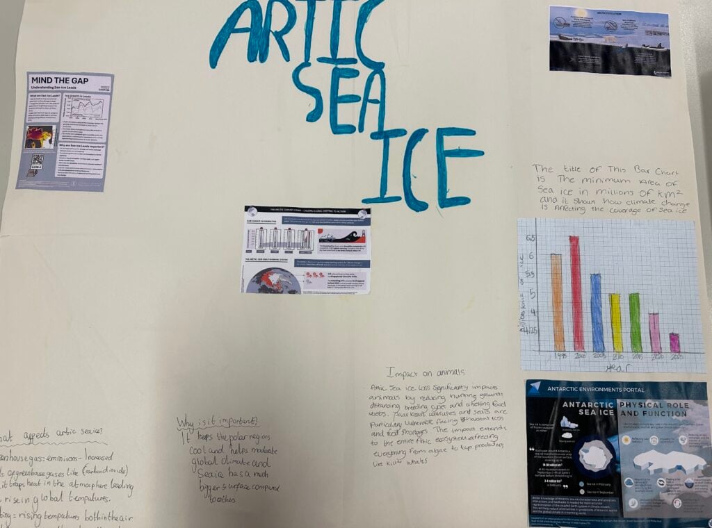
Group 5: Arctic Sea Ice – A Visual Decline
The final group looked at how Arctic sea ice has changed over time. They created a bar chart comparing sea ice levels from 1995 to 2025, showing a clear decline over the 30-year period.
Their work helped highlight how rising temperatures are affecting our planet’s polar regions—and why this matters for ecosystems, wildlife, and sea levels.
This project was a brilliant example of how students can use maths and science together to explore real-world challenges. Not only did they strengthen their understanding of data and climate, but they also developed teamwork, research, and communication skills.
I am incredibly proud of the effort and thought our students put into their work—and the powerful messages they shared about the state of our planet. 🌍📊
Mrs Barnes and X28 Maths